Glossary
- ARIA
- ARIA is shorthand for Accessible Rich Internet Application. ARIA is a set of attributes you can add to HTML elements that define ways to make web content and applications accessible to users with disabilities who use assistive technologies (AT).
-
accessibility
/ ækˌsɛs əˈbɪl ə ti / - noun: the design of products, devices, services, or environments so as to be usable by people with disabilities.
-
disability
/ ˌdɪs əˈbɪl ɪ ti / - noun: a physical, mental, cognitive, or other condition that interferes with, or limits a person's ability to engage in certain tasks or participate in typical daily activities and interactions.
-
Inclusive Design
/ ɪnˈklu sɪv / / dɪˈzaɪn / - compound noun: a design process in which a mainstream product, service or environment is designed to be usable by as many people as reasonably possible, without the need for specialized adaptions. Design for one, extend to many.
-
Universal Design
/ ˌyu nəˈvɜr səl / / dɪˈzaɪn / - compound noun: Universal Design is the design and composition of an environment so that it can be accessed, understood and used to the greatest extent possible by all people regardless of their age, size, ability or disability
-
Disability Inclusion
/ ˌdɪs əˈbɪl ɪ ti / / ɪnˈklu ʒən / - compound noun: creating equitable experiences for people with disabilities
This post is part of a April 9, 2020 CoP session on Accessibility 101.
#cop-accessibility
Screen readers. Keyboards. These are often the first things to come to mind when we talk about accessibility in the digital context. Those are important examples of assistive technologies that benefit from inclusive design patterns. But that’s not really all accessibility is.
I’ve been asked things like “how are we doing on accessibility” and “when are we going to get better at accessibility”? While I understand the question at hand, when we apply our Nike accessibility definition, that’s kind of like asking “how much does it cost to build a house?”.
Truth be told, we’ve always been really great at focusing on the accessibility of well sighted touch and mouse users, but maybe not so much non–sighted keyboard users. We have room to improve there, but accessibility has always been at the heart of what we do. We just need to apply and distribute focus more inclusively.
Accessibility has and will continue to become an aspect of your work. As it enters the conversation, ask yourself, as well as your peers, “are we talking about Nike accessibility?”. Remember that accessibility is the experience of all people of all abilities. Not just disabled, or different abled, or completely abled; everyone. Our maxims are clear and leadership has spoken. This is and will continue to be important.
Designing for everyone is an incredible challenge. But, we can rely on two things:
- Inclusive Design patterns benefit everyone
- Web Standards are inclusive
The key to achieving Nike accessibility is always going to involve weaving inclusive design patterns into our products upfront. This is true in our tangible products, such as our FlyEase Shoes, and it is as true the experiences of our digital products such as nike.com itself.
Make it inclusive. Everybody wins.
The Accessibility Tree
To many of us a webpage is a very visual experience. But sight is just one way an inclusive webpage can be accessed. Given that HTML is implicitly accessible, by authoring our document with the appropriate DOM elements and attributes, it should be very accessible early on. It isn’t until we start styling things and bolting on asynchronously functionality that we mess things up. Often we slip up by removing something, or preventing it from initially having been there, in one way or another.
In the case of modals, it’s often the opposite, but that’s another story.
Grok the Chrome Developer article below but better yet bookmark it and return to as you create or implement new experiences. Whenever we write to the Elements Tree, we need to also be considering the Accessibility Tree.
Accessibility is multidimensional. We predominately focus on the physical axis, in other words those with physical impairments, but there is a contextual axis as well. A user is a combination of context, and often, an actual person and their level of ability and adaptability. For example, someone, such as a jogger using AirPods, may be physically well sighted, but contextualy non–sighted, and rely on the very same assistive technologies that physically adaptive and disabled people benefit from as well. Inclusive design patterns benefit everyone.
Join the <div> Challenge
A <div> is the least semantic block–level HTML element. It’s semantically meaningless, nothing but <span style="display: block">. Before you resort to a less semantic element like a <div> skim the list of HTML Elements three times in search of a more appropriate element. Over time, this list will become more and more familiar.
Inclusive Links
Links are a great example of the inescapable truth that accessibility can’t always be “coded” at the end of the process. Cordelia Dillon once said “Accessibility is a blueberry muffin—you can’t push the berries in afterward”. She’s right. When need to think about this from the beginning. Let’s take the COVID-19 announcement banner as of the time of this writing as an example.
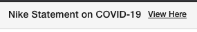
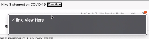
There’s text to that reads “Nike Statement on COVID-19” followed by a link reading “View Here”. As discussed in #cop-accessibility, the issue is that all relayed to the accessibility tree here is “View Here” which, without context, isn’t very helpful.
Imagine the markup for the banner was the following:
<p>Nike Statement on COVID-19 <a href="covid-19.html">View Here</a></p>
We could technically make it more accessible a number of ways. There’s ARIA attributes such as aria-label and aria-describedby as well as clever HTML patterns. But before we get into any of that, could the copy be more accessible? Is this Nike accessible copy? As Ross pointed out, one way to improve accessibility here is simply authoring more inclusive content.
<p>Please read <a href="covid-19.html">our statement on COVID-19</a></p>
So, avoid “Click here” and “here” links that have no context. Challenge yourself to make them more inclusive in both external and internal experiences, documents, and communications. Remember that Nike Accessibility applies to everyone, be they an employee, consumer, partner, or community member.
Inclusive Interactions
Think of the accessibility of a user experience
Sometimes it’s fun to make something extremely inaccessible and then discuss various issues we find. Grok the below CodePen. Perhaps recreate one of your own.
See the Pen mdedrmg by JP DeVries (@jpdevries) on CodePen.
How’d you make it more accessible? Did the more accessible version involve more code? or less code? Discuss your findings and perhaps share your pen in #cop-accessibility.
Inclusive Styles
Once we made the inaccessible button above more accessible browser heuristics, in other words the user agent sheet, automatically styled it with focus styles. In most browsers this is some sort of blue outline that indicates the element currently has keyboard focus.
In addition to understanding what focus styles are, it’s important to understand when, if, and how to manipulate them.
The short answer is don’t do it. Leverage the implicit accessibility of the user’s browser heuristics. For one reason or another they’ve either chosen that browser because it suits them best, or they’re stuck with it; either way they probably aren’t going to be shocked or offended when presented with the browser chrome of their current browser.
Nevertheless, the long answer is design systems often mandate the same “look and feel” across browsers. This can lead us to aggressive CSS resets that remove the implicit accessibility of browser heuristics without necessarily adding it back. Whenever you’re tasked with changing the style of interactive elements follow this checklist:
- is this necessary?
- have we proven (A/B tested) that this out performs native HTML and browser chrome?
- most importantly, does this align with our design system?
Then:
- run accessibility scans (PA11Y, Lighthouse, axe core)
- audit for any potentially introduced accessibility issues
For example, if you’re tasked with removing button:focus styles for mouse users, make sure you don’t do the same for keyboard users. Stay out of the business of deciding if and when a user is a keyboard or mouse user. Tap into browser heuristics like CSS 4 :focus-visible and their corresponding polyfills as a source of truth for your responsive adaptations.
WCAG
You’ll come across this acronym if you haven’t already. The Web Content Accessibility Guidelines are a well curated and evolving collection of various standards and levels of success criteria.
Web Content Accessibility Guidelines (WCAG) is developed through the W3C process in cooperation with individuals and organizations around the world, with a goal of providing a single shared standard for web content accessibility that meets the needs of individuals, organizations, and governments internationally.
There are three levels of success criteria. Level A, Level AA, and Level AAA. Think of Level A and Level AA as the rules of the game. These are things we need to do to not be disqualified or penalized. WCAG 2.x Level AA is considered what’s expected in terms of compliance both legal and socially. Level AAA is like extra credit. If Level A is “everyone gets shoes” and Level AA is “everyone gets nice shoes, everyone gets Nike shoes” then Level AAA is “everyone gets custom tailored Nike ByYou shoes”. An example of WCAG 2.x Level AAA compliance might be automatically responding to a user’s preference for a dark mode and serving the experience tailored accordingly.
The accessibility principles are broken into four parts and can be memorized with the “POUR” acronym.
- Perceivable
- Operable
- Understandable
- Robust
If you can vaguely recall WCAG next time you see it, remember that Level AA is an important level of compliance to achieve, and that POUR has something to do with it all, you’re off to a great start. Chip away at the guidelines themselves over time and at your own pace.
Resources
Bear in mind that recommending tooling and resources is subject to change as many exciting developments are always at play. Here’s some resources.
Internal
Free
- A11yWeekly Email Reading List
- NIKEU: Accessibility Program Training
- Pretty much anything Smashing Magazine has written on the topic
- 24 Ways: Accessibility
- axe - Web Accessibility Testing (Chrome Plugin)
Not Free